The insurance landscape has been cluttered for a long time. Many of FWD's competitors have been going down the low price route or the sob story route. Although the product offering is almost the same across every brand (small differences here and there), we wanted to differentiate FWD through the feeling you get when you have FWD covering you.
Happy Dance
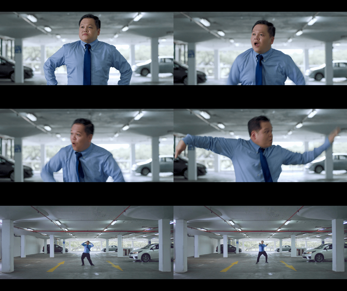
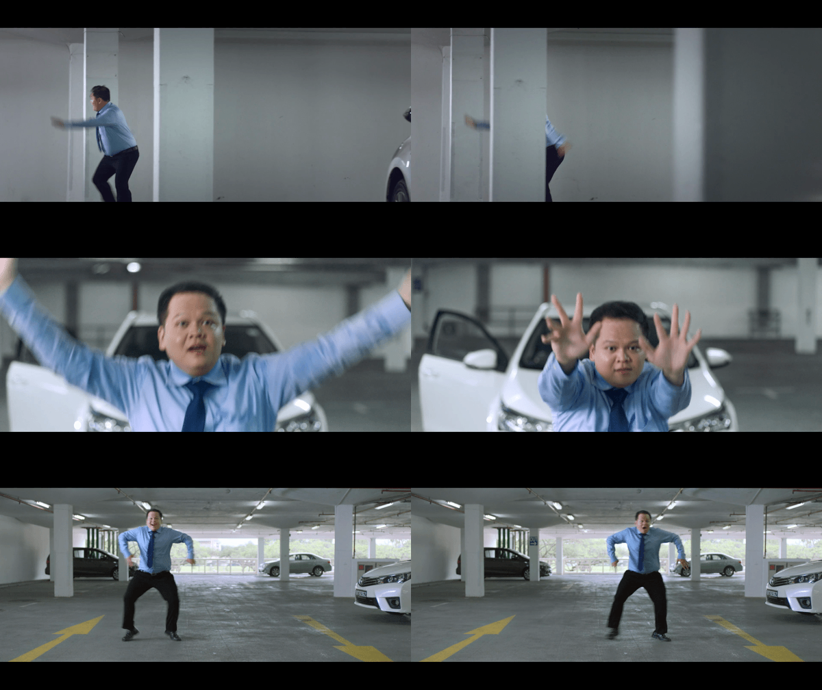
When words fail to capture the depth of joy you feel towards the FWD Car Insurance offers, you find yourself compelled to express it through the language of dance.
Agency: DDB Singapore
Creative Directors: Chris Chiu, Thomas Yang
Head of Art: Thomas Yang
Art Director: Adithya Deepan
Copywriter: Malhaar Rao
Director: Peggy Goh (Freeflow Productions)
Selfies
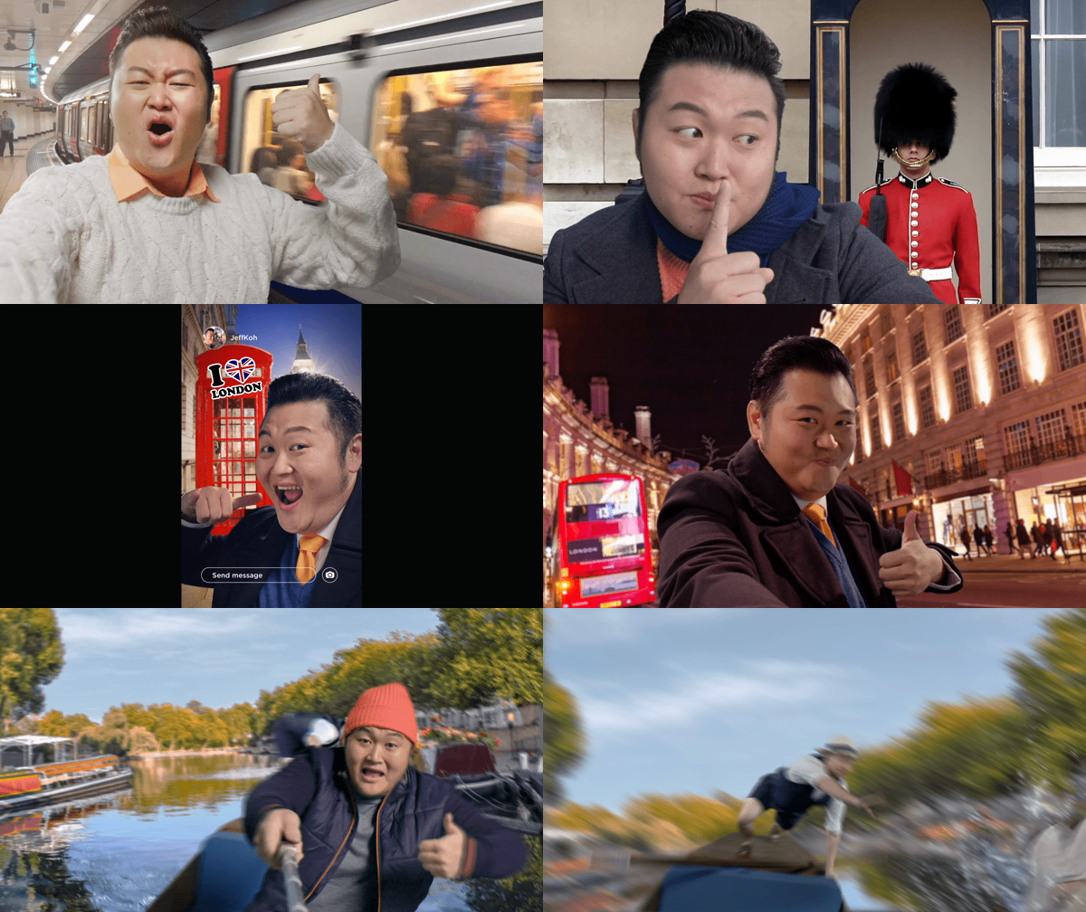
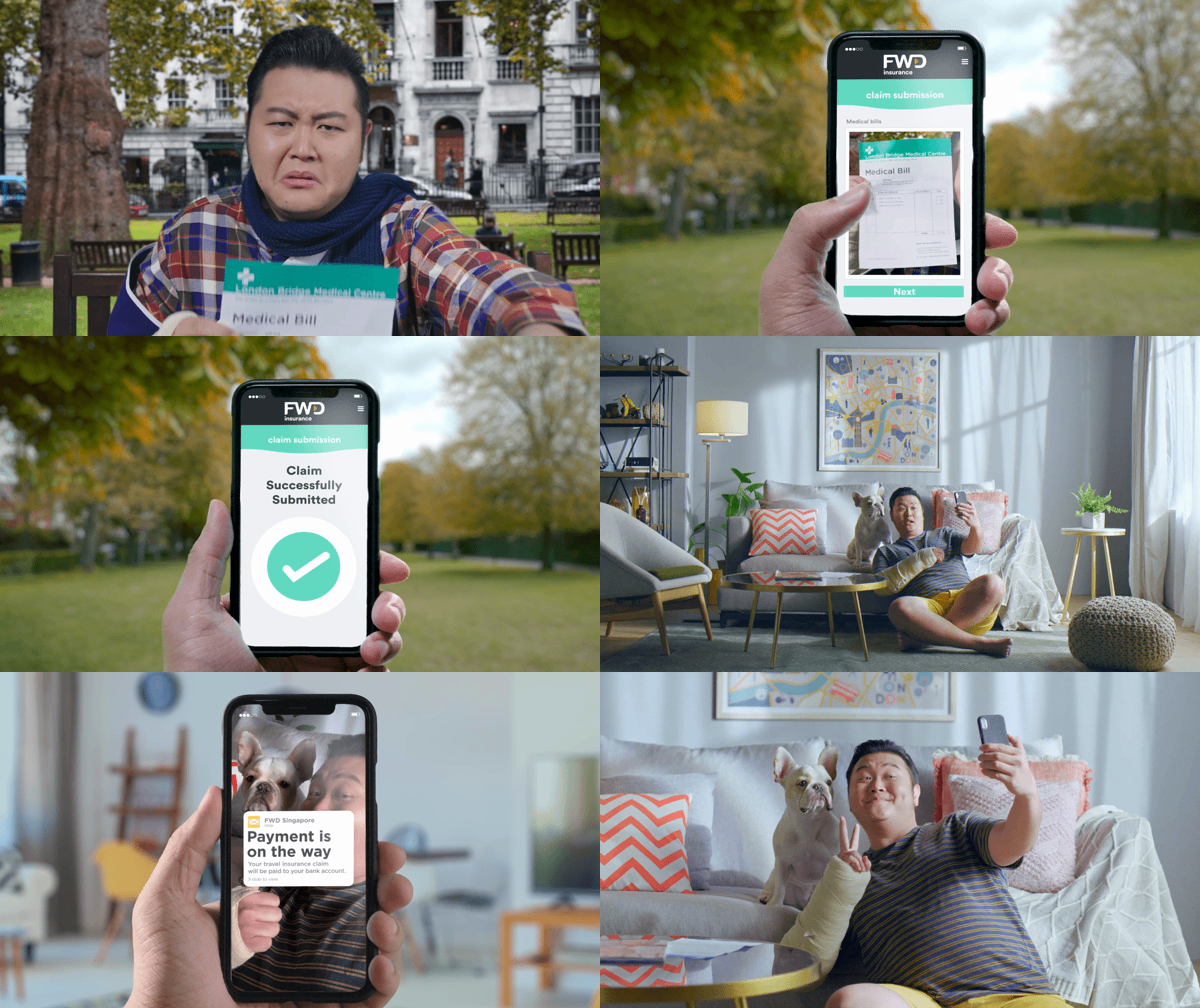
With Travel, we brought out the ease of submitting your claims with a natural behaviour when you travelled: Taking selfies. All you had to do to submit a claim was to snap a "selfie" of your documents and you would get your payout. Simple, easy and a total breeze. The spot was also almost entirely shot out of selfies.
Agency: DDB Singapore
Creative Directors: Chris Chiu, Thomas Yang
Head of Art: Thomas Yang
Art Director: Sin Eng Lee
Copywriter: Malhaar Rao, Ivan Ng
Director: Jake Nam (Rolla)
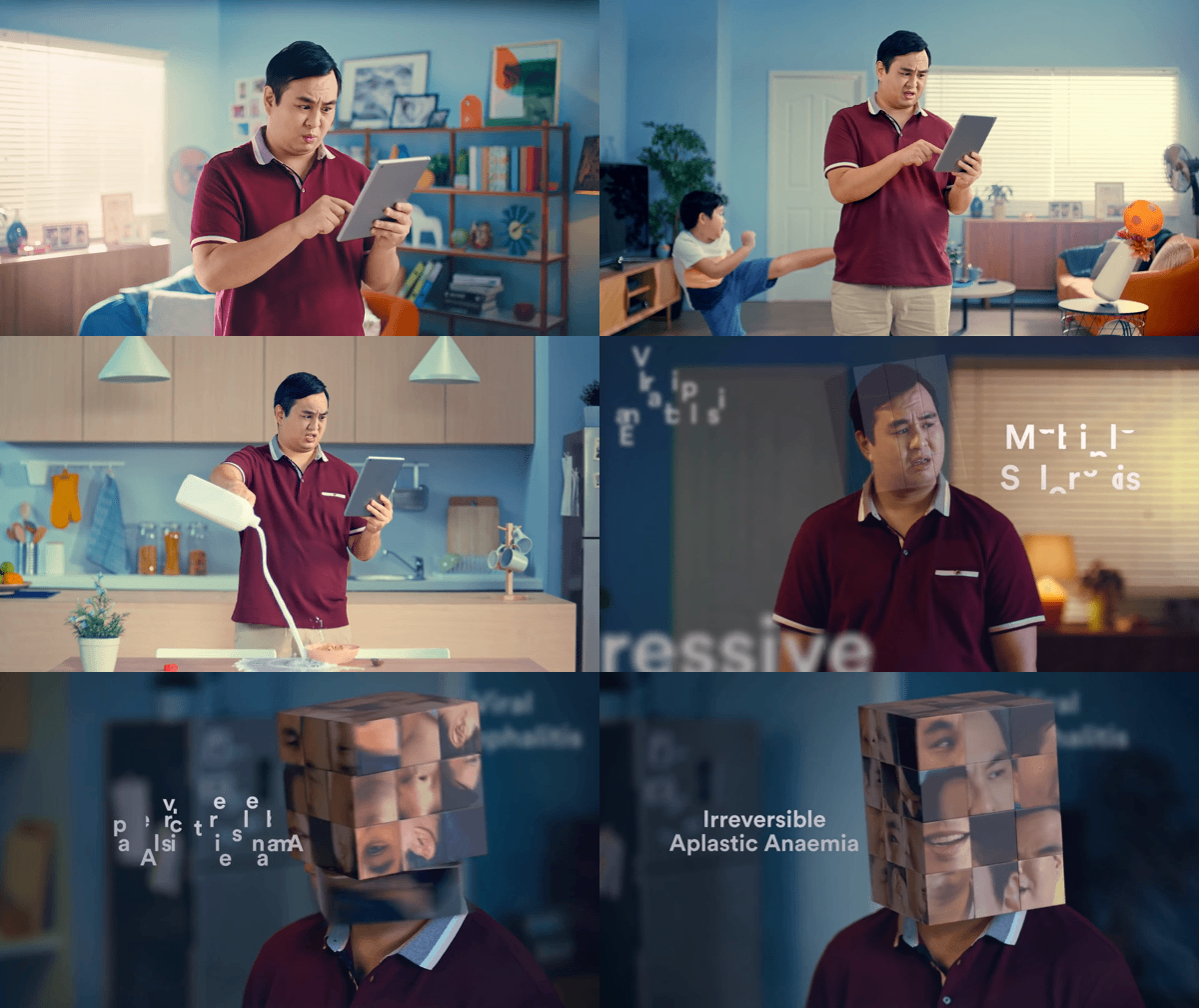
Rubik’s Head
Choosing critical illness coverage can really mess with your head. But who says it has to be?
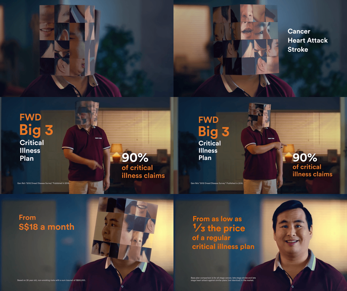
We portray the man's confusion in the most literal way – by shuffling his head into a Rubik's cube that gets more and more jumbled as he dives deeper into indecision.
Fortunately, FWD's Big 3 Insurance Plan is a simple way to cover oneself against heart attack, cancer, and stroke without needing to navigate complicated plans.
Agency: DDB Singapore
Creative Director/ Head of Art: Thomas Yang
Art Director: Felicia Angela Rouge
Copywriter: Josh Armstrong
Director: Rick (Abundant Productions)